Header box...again
What do you think now. The colour is a little bright now, for my liking, but it is definately easier to read. Mamma Bear, can you read it now?? lol.
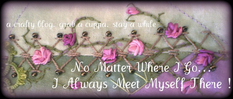
Does it bother anyone else that the pic is slightly crooked? It bothers the heck out of me, if a line should be straight, it should be STRAIGHT. I don't have to read my own blog, so I'll leave it.
Thanks for your suggestions. I did try black, but that was worse than white.


3 comments:
I like it with those larger, colored letters. I can't say that it bothered me, exactly, that it isn't perfectly straight, but I did notice.
You asked... Better! I would love it if the color of the words were the color of the blue in the headings and sidelines.
I like the look. Especially, the 'crooked' part. CQ, well heck...art is an abstract expression to begin with, isn't it? Not straight or black or white. I like it!!!!!!!!
Post a Comment