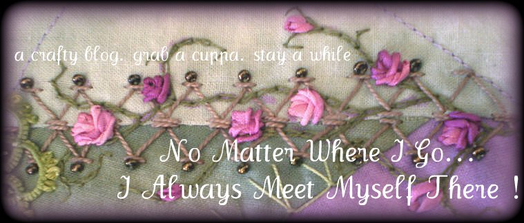
New header box
Well, what do you think about my new blog title box?? This took a fair bit of time..and PLEASE don't ask how I did it, I don't think I could tell you.
I used this link to help, but I also took out the original header box.
I like it. It lets you know what I'm all about, but I would like the writing to be clearer, however, enough is enough, this is as it stays. As I removed widgets from the template, I will not be going back to how it was, but I can change the picture whenever I please...I hope!
Back to school and Playcentre tomorrow. I really don't want to do it. Brooke has been sleeping until 10am everyday, she is going to be nightmare tomorrow.
I have completed a couple more 3" squares, pics tomorrow, maybe.


14 comments:
Jo, the new header is beautiful! I'm on dialup so it was slow loading. But it might just be I had too much open and trying to load. I loved the little 3 x 3s, one day perhaps I will venture into CQing. That certainly puts in in a very tempting size!
IT's wonderful! I still have the plain white no frills blog! One day I'll take the time to explore and learn... if I can take a break from stitching in all my spare time!
Your new header is FAB! and LOVE those 3" beauties too!
I just stopped by to check the header again and this time it loaded right up, Jo! So it really was a browser problem last night and then too after the initial visit perhaps its quicker to load.
Jo, the header box is just lovely! Your talent has no ends:)
HUGZ:)
Candi
Very nice! I changed my template once and it was such a pain I've never changed anything since as I lost all my links etc.
Lovely 3" squares, you are soooo patient!
PS hasn't Roger Waters already been?
your new header looks good Jo.
You clever girl...I know how tricky that is to do.
Well done!
I like it Jo, what if you made the font Black? Just a thought. Of to work on my 3x3s.
That's a great header, Jo. Very representative of what you do.
I really like the colors you used for your 3" blocks, too. They look great!
The header looks great on your blog Jo, nice colors! and the 3"squares are so wonderful!
Your blog is fantastic I like crazy but I'm not able to do it.
ciao ciao from Italy. Excuse my mistakes in writing.
its lovely! I wish I could figure it out!
try a darker color for the fonts It will make them pop
off the pastels of the picture;)
Jo,
You could try fading the photo so it's a little transparent so the font will show up better, AND I think bigger font would make it easier to read too. It's really nice seeing a seam treatment as a header!
Melissa
Post a Comment